
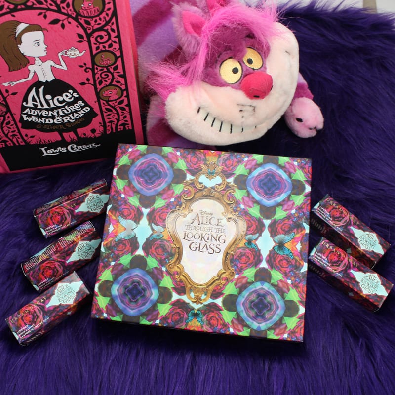
Urban Decay Alice Through the Looking Glass Eyeshadow Palette
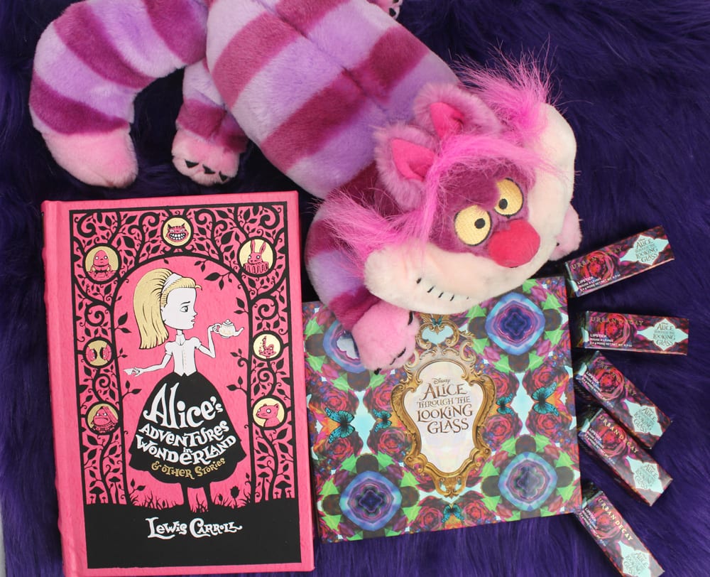
As soon as I saw that there would be another Alice movie, I fervently hoped that UD would do a collaboration. I’m excited to share with you my thoughts on the new Urban Decay Alice Through the Looking Glass Eyeshadow Palette. I LOVE Urban Decay. This is no secret. They’re my #1 favorite brand. I’m sure that’s clear because of the numerous looks, reviews and giveaways I’ve done. They’re also the brand that gets the most attention from you on my blog! Make sure you check out the Alice Through the Looking Glass lipsticks too!
Urban Decay Alice Through the Looking Glass Eyeshadow Palette
PR sample.
This collection launches May 1, 2016 on Urban Decay’s website and then it will launch later at Sephora, Ulta, Macy’s and Beauty.com. It’s Limited Edition and will likely sell out fast.
Watch my thoughts on this collection in my video!
Price
$60 for 20 x .04 oz
Where to Buy
UrbanDecay.com, Ulta, Sephora, Macys, Beauty.com
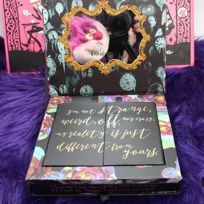
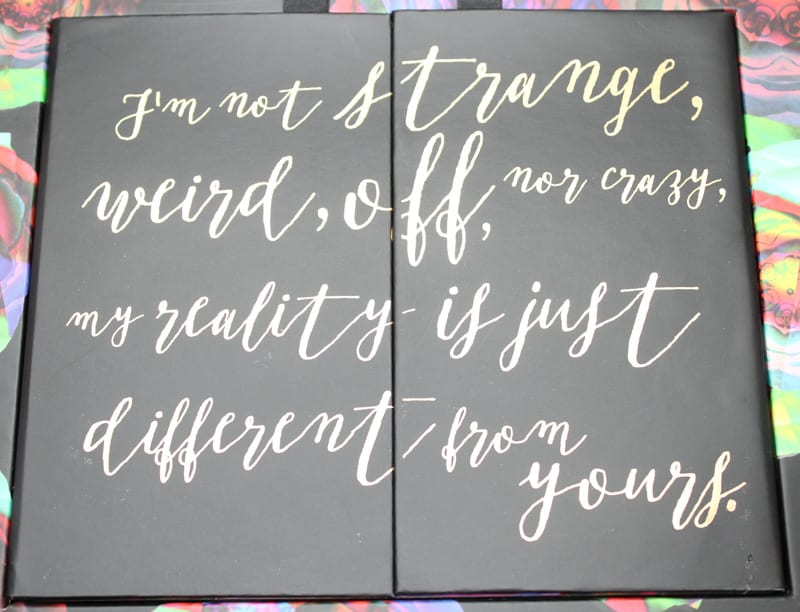
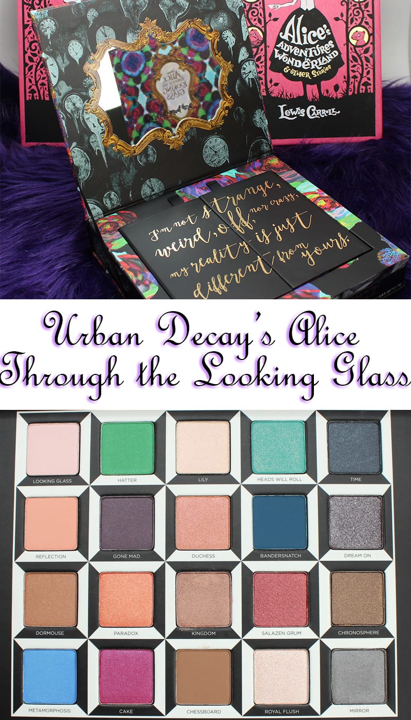
“I’m not strange, weird, off, nor crazy, my reality is just different from yours.” – The Cheshire Cat. I LOVE this quote!
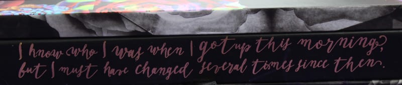
“I know who I was when I got up this morning but I must have changed several times since then.” – Alice

The Dual ended brush that comes with the palette.
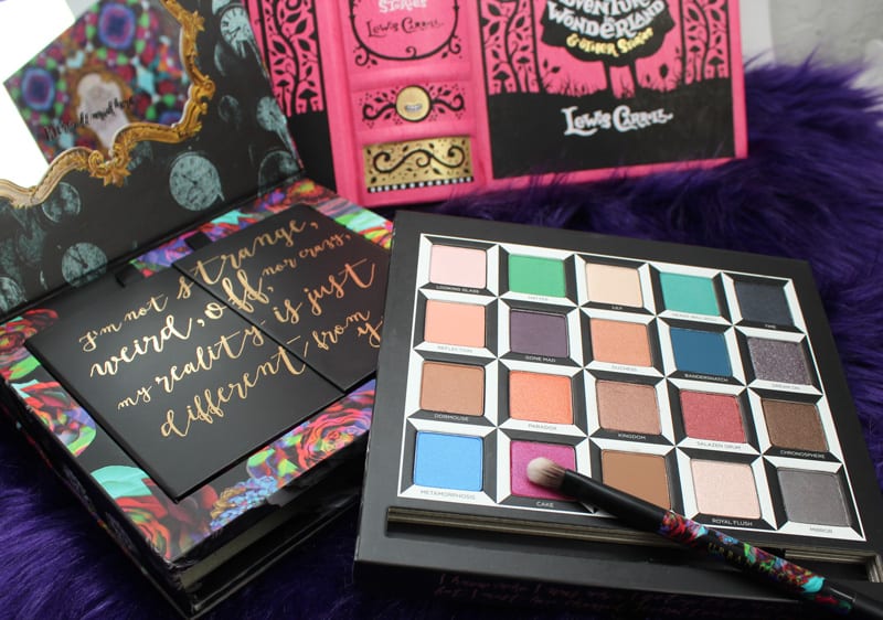
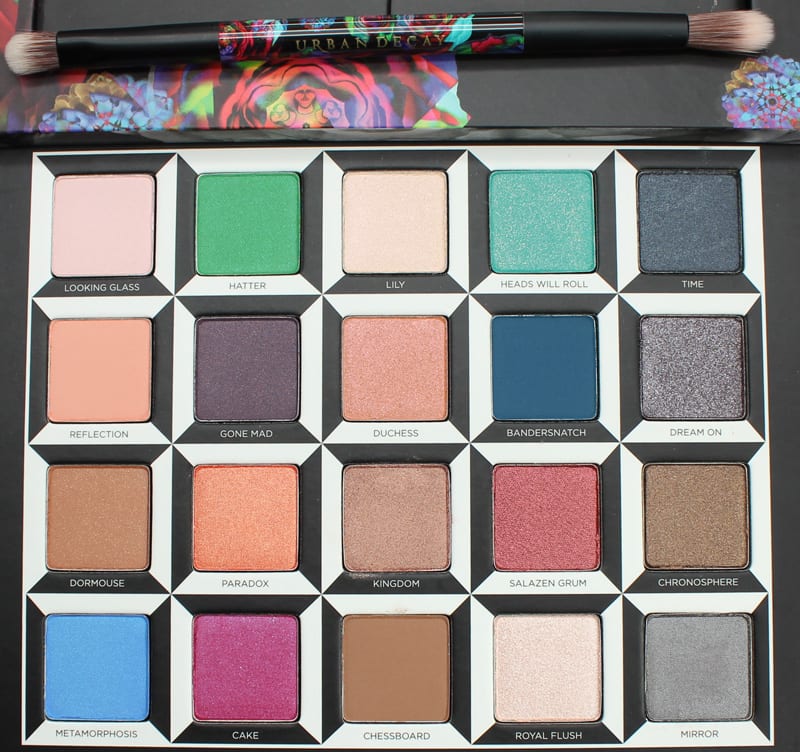
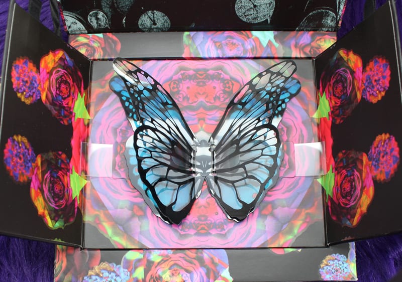
The Alice Through the Looking Glass Eyeshadow Palette is truly a collector’s item and beautiful to behold. The colors are arranged by character in columns from the left to the right – Alice, Mad Hatter, Mirana, Iracebeth and Time. They each have coordinating lipsticks too. All 20 shades in this palette are brand new. The packaging will seriously blow you away. It’s so stunning.
Not gonna lie, I did cry when I realized this was probably Alan Rickman’s last movie. He plays Absolem the Blue Caterpillar. Johnny Depp is back as the Mad Hatter, Anne Hathaway is the White Queen, Helena Bonham Carter is the Red Queen, Sacha Baron Cohen is Time, Mia Wasikowska is Alice, and Michael Sheen is the White Rabbit.
Urban Decay did another Alice palette several years ago and it sold out almost immediately. So if you are an avid Alice in Wonderland collector and you love this palette, keep your eyes peeled for it. Urban Decay LOVES Alice in Wonderland and many things around their headquarters are Alice themed. You can see more about their Headquarters here.
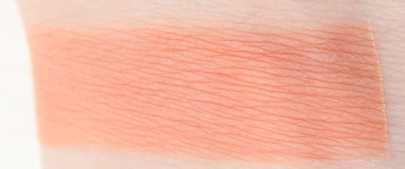
All of the swatches below are on primer. In the shots where you see multiple colors at a time, the top swatch is primer, the bottom is bare skin.
ALICE
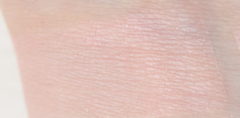
Looking Glass
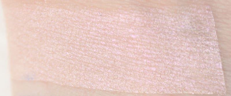
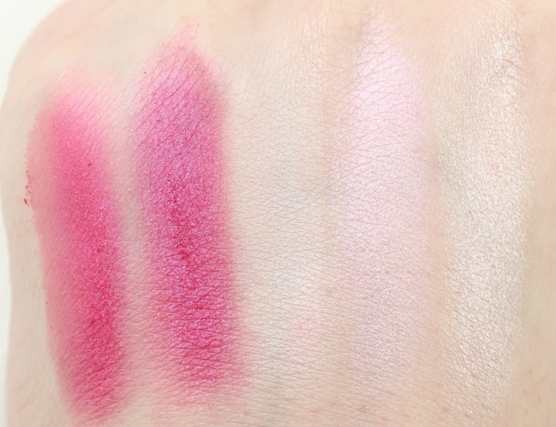
pale pink demi-matte
ultra pale pink satin-matte
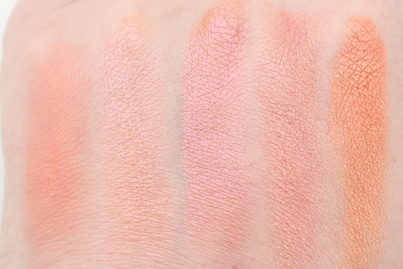
Reflection
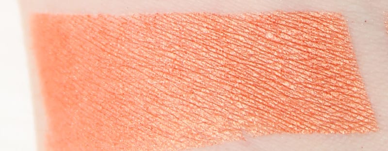
soft peach matte
light peachy orange matte
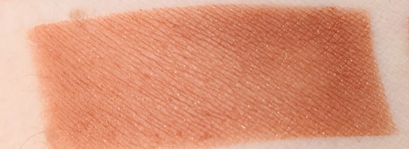
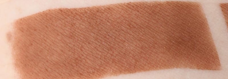
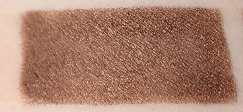
Dormouse
warm brown matte with floating gold micro-sparkle
brown with orange undertone matte and subtle gold sparkle
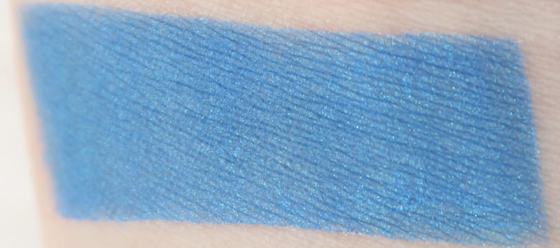
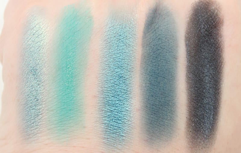
Metamorphosis
vibrant periwinkle blue with micro-sparkle
vivid cornflower blue with subtle sparkle, less pigmentation than I liked but easily built up on primer. This does make me think of the Caterpillar.
MAD HATTER
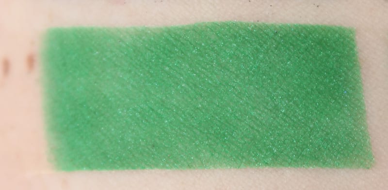
Hatter
vibrant green with tonal micro sparkle
bright, rich green with subtle green micro-sparkle, less pigmentation than I liked but easily built up on primer
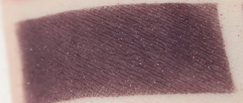
Gone Mad
aubergine with pink iridescent pearl
deep eggplant purple with brown undertones and subtle pinky-violet micro-sparkle (wish this was a blue-toned or royal purple, I’m tired of this shade of purple being everywhere)
Paradox
vibrant orange with gold pearl
bright orange with gold shift, really gorgeous
Cake
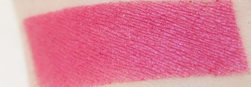
saturated blue-pink with silver micro-sparkle
deep fuchsia pink with silver micro-sparkle, really pretty
MIRANA
Lily
opal pink pearl
white pearl with pink iridescence, love this duochrome
Duchess
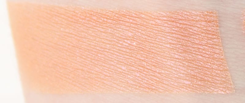
peach with pink shift and micro-sparkle
soft peachy orange with strong pink iridescence and micro-sparkle, love this soft duochrome
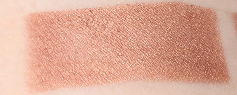
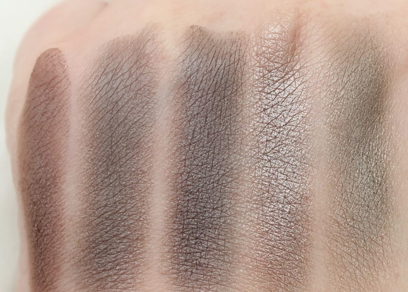
Kingdom
copper-bronze pearl
coppery brown pearl
Chessboard
medium brown matte
midtone brown matte
IRACEBETH
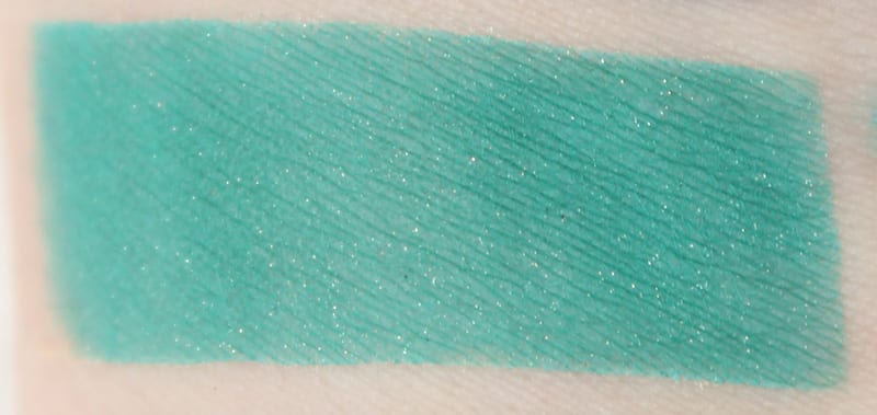
Heads Will Roll
vibrant turquoise with gold micro-sparkle
vibrant turquoise green semi-matte with gold micro-sparkle. I wish this was more blue-toned than green toned. This was pretty easy to work with layered on top of Bandersnatch.
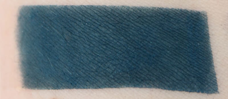
Bandersnatch
deep teal matte
deep dark ocean blue with navy tones (love) This took a little bit of effort to blend out in my crease.
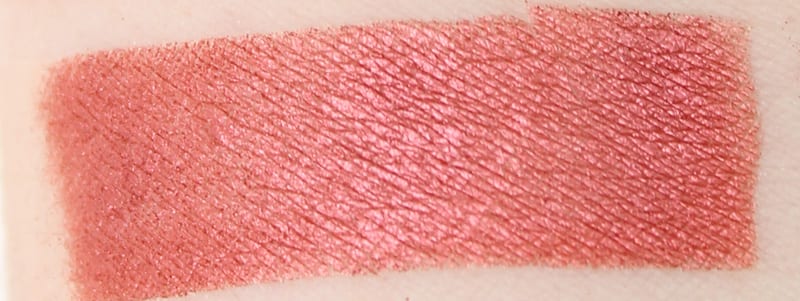
Salazen Grum
metallic crimson
metallic red with orange undertone
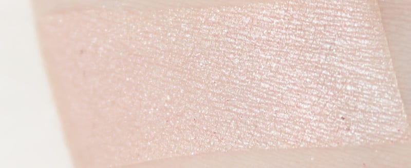
Royal Flush
pale beige shimmer
ultra pale pinked beige shimmer, works nice to layer on top of other shades
TIME
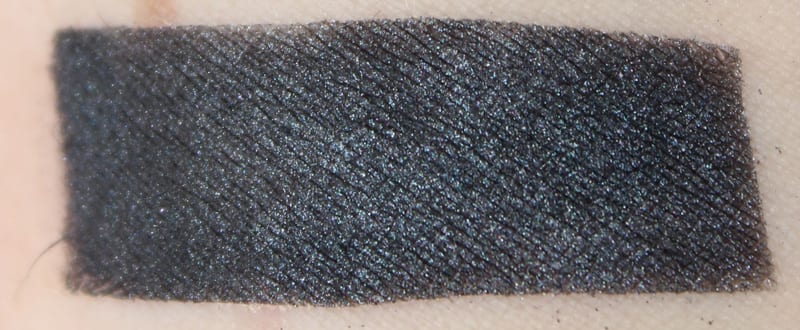
Time
black-navy satin with soft iridescent micro-sparkle
gorgeous blackened navy with iridescent micro-sparkle (love) One of the best shades in the palette and so easy to work with
Dream On
metallic purple-silver
super sheer grape purple with silver sparkle (disappointing, the worst shade in the palette)
Chronosphere
metallic deep bronze
Metallic deep bronzey brown
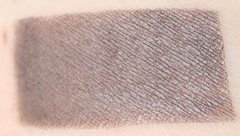
Mirror
gray-taupe satin
gorgeous deep grey taupe satin
I broke the swatches up into colors that I felt sort of went together.
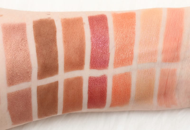
L to R – Kingdom – Chessboard – Dormouse – Salazen Grum – Paradox – Duchess – Reflection
The warm, orange and red toned shades are above. There are 8 brown, orange, or red shades, out of 20. That’s almost half. That’s a whole lot of super warm.
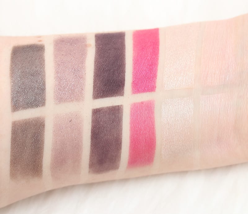
L to R – Mirror – Dream On – Gone Mad – Cake – Royal Flush – Looking Glass
The cooler toned pinks / greys / purples are above. They sort of make me think of Too Faced Chocolate Bon Bons. There are 7 pinks, purples and greys.
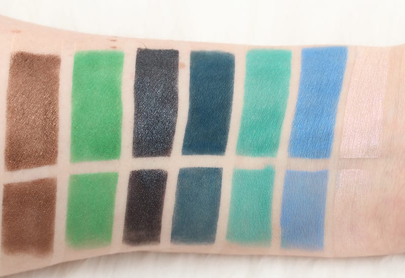
L to R – Chronosphere – Hatter – Time – Bandersnatch – Heads Will Roll – Metamorphosis – Lily
These are brighter hues of mostly blues and greens. There are 5 blues and greens.
The swatches below are on bare skin on the back of my hand.
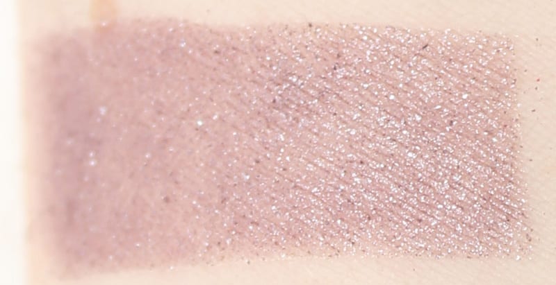
I did want to swatch similar colors with some of the shades in the palette. Mirror is deeper than Desperation, but it looked like the most similar color I had to it.
Uncut is more sparkly than Gone Mad for sure, but they’re both the same color family of purple. Riff and Dormouse look very similar to me.
Woodstock is warmer than Cake, which is more blue-toned. Looking Glass and Royal Flush are both whitish, though Looking Glass is more matte, while Royal Flush is super sparkly. Lily is such a pretty iridescent pink.
Heads Will Roll is more green-toned than Shattered or Haight.
Reflection is almost like a matte version of Paradox. Duchess is Fireball’s delicate little sister.
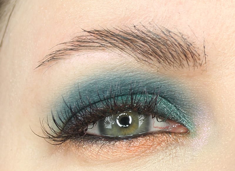
I used Walk of Shame as a base shade. Wearing Bandersnatch on the lid and hood with Heads Will Roll layered on top on the lid, with Royal Flush layered on top at the inner lid. I used Paradox on the lower lid with Duchess layered on top at the inner lower lid. I used Time on the lower waterline and at the outer upper and lower lash line. I used Lily to highlight.
What I Didn’t Like About This Palette
While I do appreciate that each vertical column is influenced by a character, it’s hard for me to see how some of those shades are meant to work together. I thought it was a little weird to have Looking Glass, Royal Flush and Lily in the same palette because they all look very similar on my skintone. Dream On was a huge disappointment because of its lack of pigmentation. It may work for layering, but on its own it looked very sad. There were so many warm, orangey tones, which made me think of the Too Faced Peanut Butter & Jelly Palette. I’m soooo tired of so many warm palettes!
While I definitely love Duchess and Paradox, also having Reflection, Dormouse, Salazen Grum, Chessboard and Kingdom felt like such overkill on the warm front. Gone Mad made me sad because it was an eggplant purple brown type shade rather than a true purple. Metamorphosis, Heads Will Roll, Bandersnatch, and Gone Mad were somewhat patchy and less pigmented on bare skin than I thought they should be.
What I Loved About This Palette
The packaging. The packaging is amazing. It feels special. I love Bandersnatch, Time, Heads Will Roll, Hatter, Mirror, Cake, Duchess and Paradox. I do feel they are gorgeous. Kingdom is unusual and pretty. I really want Time, Bandersnatch and Paradox as singles. I like Duchess quite a lot too.
You’re getting 20 eyeshadows that are .04 oz each. A full size Urban Decay eyeshadow is .05 oz and runs you $19. For me, the standout shades are Heads Will Roll, Bandersnatch, Time, Hatter, Lily, Cake, Looking Glass, Mirror, Reflection, Duchess, Paradox and Kingdom. I also think that Dormouse, Salazen Grum, Chessboard, Royal Flush, Gone Mad, and Chronosphere are good shades if you like the colors, though some of them need primer.
What I love about Alice in Wonderland and Alice Through the Looking Glass (the movies) are that you have so many gorgeous, vivid colors and visuals to draw inspiration from. There was definitely an opportunity here to have brighter purples and other bright colors, rather than the muted shades of Gone Mad and Dream On and all the orangey shades. I really would have liked to have seen more duochrome shades in the palette, as well as brighter colors.
If you are an avid Alice in Wonderland or Urban Decay fan and collector, you need this palette. If you’re not a fanatic, you may not need this palette, especially if you have some warm toned palettes in your collection.
What do you think of the Alice Through the Looking Glass Eyeshadow Palette?
More to See
Oh my goddess, I’ve found one on eBay. It’s not like I don’t already have these colours… but the packaging! Why am I such a sucker for this kind of thing?? It’s exquisite.
I agree, Cake, Duchess and Paradox are dynamite colors from this palate, some of the others were meh, and so I didn’t want to buy the palette full price just for a few gotta have colors (though have been looking for dupes, especially Cake). Was lucky enough to find a wayward palette for 1/2 off yesterday, YES! so now I’ve got them, but wish Urban decay would make some singles. Seems like they are making some teasers with the names somewhat similar to this collection, but not seeing any true singles yet of the better shades?
Do you have any tips on getting a more pigmented and opaque result with these? Your swatches, especially the brighter colors, are more pigmented than I can ever get mine with this palette unless I mix them with inglots duraline. I use too faced primer potion and apply them with either my finger (best result), a morphe brush, an urban decay eyeshadow brush, or a real techniques eyeshadow brush.
So I’m pretty sure I applied these swatches on primer with a q-tip. The way I would apply them on your eyes would be to use an eyeshadow primer, then pat the color on with a brush like the UD Moondust brush. You could also spritz your brush with UD All-Nighter Spray to intensify the color. My eyes are hooded, so I can’t really use a finger tip to apply color easily, but if that works for you, you can definitely do it that way. I’d still apply with a brush first and pat / stipple it on, then go back with a finger.
Ahh yeah, my notes above say ‘All of the swatches below are on primer. In the shots where you see multiple colors at a time, the top swatch is primer, the bottom is bare skin.’
I used q-tips to apply these swatches onto my skin.
Where can I get it!??
It will be available May 1st at UrbanDecay.com.
Will there be a link to the items
Yes, they’re linked above at the top under ‘Where to Buy.’
Ok thank u
No problem!
Those colors are absolutely gorgeous, but I definitely see what you mean about so many similar colors.
I wish there were more greens a better purple and brighter hues. But that packaging is irresistible!!
You always have the best descriptions and swatches for each color. Cake is definitely my favorite in this palette.
My teenager was just talking about this! I can’t wait to show her your blog.
I was so excited to see what this Palette was going to look like. I love purple, but I had to laugh when I read your comment about Gone Mad. It really is everywhere. Thank you for letting me see it with all your great photos! xo
I fit into the category of non-fanatic who already has a lot of warm colors, so this is a hard pass for me. But enjoy it, everyone!
Girl that eye look YESSSSSSSSSSSSSSSSSSSSSSSSSSSSSSSSSSSSS. I can’t wait for this collectionnnnn!!
This is so much fun! I remember buying some of the Alice in Wonderland OPI nail colors at WDW when the first movie was coming out. And these colors are so pretty and with fun names to boot. 🙂
Thank you so much for the gorgeous photos of the packaging, all the swatches, and the up close photos of the palette. I can see what they were trying to do here, they were trying to take the essence of Alice and make into one palette that would appeal to people who love the warm tones AND love color, like you said it’s almost like it’s two different palettes in one-I totally agree on that shade/tone/finish (facon in french like meaning method) of aubergine,I’ve seen it a lot, in singles and palettes I think it could have been a lot richer a lot more purple. If they wanted to do brights and warmer tones, don’t mute down the colorful shades-omg with the Dream On!-so not what you expect from UD- And there are so many warmer palettes out there(ie just got Semi Sweet which I love of course I love ETUDE that’s my matte go to-AND have Manny MUA coming(don’t know when lol), but I really love the packaging, so that makes it very special, like that it includes the brush, so for me, since I do like warm tones, have a lot now- but since there are enough shades I really LOVE that ARE special that are great for blending out/crease,it’s a yes- LOVE TIME!! (and I don’t have a shade/s like that in my collection, nor do I have a shade like Bandersnatch, or Heads will Roll, so lovely!!! (yes that one set of swatches does remind me of TF Bon Bon,, I don’t have PB& J),and have great browns already- so I will get it for SURE. And I don’t have any of the Vice Palettes, I really don’t have that much from UD shadow wise) I think the eye look you did is a gorgeous example of how to use those special shades <3 Walk of Shame as a base was perfect, Bandersnatch is gorgeous on you! I can see using that with Time to create an original smoked out eye! And I see Time as great as liner too, love that it's easy to work with! (the upper lower lashline use is perfection too!) And it will compliment that Viseart Theory Palette I just bought in Chrome. Haha hope that all made sense, thanks for the fab review in total!!!!! <3
OH yes, and also love Cake! 🙂 🙂 !
oh and love Cake!! Going to bed but can’t wait to share this post tomorrow! XO
They definitely could have gone a little brighter but these shades are pretty and work together well!
I am a little disappointed, I really think they could have and SHOULD have gone much bolder and brighter here.
Whilst the packaging is cute, inevitably you throw that away, so what is left is the quality and colours of the shadows. I agree with you Phyrra – so MANY warm toned palettes out there. And why, oh why, did UD include that mid tone brown? And not have a forest green? Time is the most beautiful colour in the palette – quite original even. I think the mattes were tricky to work with. Thank you so much for the indepth review as always.
I would have been much happier if all of those browns were greens. Time is stunning and easy to work with.
Yes I agree on the browns, they don’t have the “special quality” with the exception of that one….Time is one of the “special shades” that have me sold on it 🙂 🙂
I don’t think I’ve ever wanted a palette so badly! I was sold on just the packaging alone!
I wish the shadow quality were better, and that there were more bright shades. I am an Alice fanatic, and I love Urban Decay, so I still really want this. I’m glad to see that several of the shades I was worried about look pretty good with primer, at least. Thankfully, I can wear warm shades, but I have to agree…these do look very Too Faced PB & J.
Thanks so much for showing comparisons with other UD shades. There were several I thought looked familiar.
Yeah some of the shades were just.. I don’t know… patchy on bare skin. Once on primer, I didn’t have issues with blending (like I did those damn KVD quads), so I didn’t think they were terrible (aside from that purple Dream On). I do think Bandersnatch was a MUCH NEEDED color in UD’s lineup. Also, I feel like so many of the teals look blue-toned in the packaging but end up turning a little green-toned on me. I need my blue-toned teals! Surprisingly, I like all the peach shades that I swatched that are so similar. I know me liking the blues is no surprise 🙂
Bandersnatch does look like a great shade. As you said, they needed a blue teal like that. I can live with using primer. After Urban Spectrum, now I want all UD’s palettes to be that quality.
Yes! Even my friends who AREN’T into makeup are buying that palette because of how I’ve continuously raved about it and worn it 🙂
I’m not personally a big brights person, but I would expect a Alice palette to be full of brights. This seems pretty muted and almost neutral.
First of all, that packaging is fantastic! I’m a little bummed at the overall color selection because I feel like UD has released similar palette combos before, but I don’t think that would prevent me in the end from purchasing given the theme because I’m so excited for the movie. Thanks for swatching!
I was really hoping you’d be swatching this. The packaging is terrific. It’s not a palette for me but I can see it being very very popular.
So happy you love the packaging!
You are right. The packaging is amazing and I can see it being a great collectors item. I also like most of the cooler toned shades, warm ones don’t really do it for me.
They did a fabulous job with the packaging.
Amazing review, thank you so much. I admit, I’m obsessed with this and will have to purchase it.
You’re welcome!
I’m so disappointed with the color selection. It’s like they put all of the color inspiration into the packaging instead of the actual product. I’ll probably get this as a keepsake but I doubt I’ll use the shadows much 🙁
I really think this would have been a great opportunity to throw in several duochromes and more brights. Glad you like the packaging though!
The packaging is really pretty. The shadows aren’t really useful given my coloring. Just as well, I’m trying not to buy anything for the time being.
It always helps when someone doesn’t fit your criteria so you can save towards something that’s perfect for you 🙂
I really really want to get this palette! I am not one to hoard for the sake of “the packaging is so pretty!” but it just feels right this time 🙂
I think the colors will look great on you!
WILL DEFINITELY BE BUYING THIS OMGGGGGGGGGGGGGGGG
Glad you love it!
Omg these pictures are phenomenal..that packaging!!!!
Thank you so much! I spent a ton of time on the photos 🙂
???
I LOVE the feel and the packaging (the quotes!) of this palette. But the shades aren’t screaming my name.
I can totally understand why. The packaging is top notch.
I was really looking forward to this palette. D= Your swatches are the 3rd set I’ve seen tonight and some of the colors are so disappointing in color and they seem pretty patchy. I’m really surprised they didn’t do more different bright shades. Why so many brown/orange. They had such a great opportunity to really do some fun colors and only a handful are really fun and bright.
I was surprised by how patchy some of the shades turned out to be. A few I really love (the blues and greens), I was surprised that I loved the peachy oranges, but I was definitely dismayed at the number of orange / browns.