
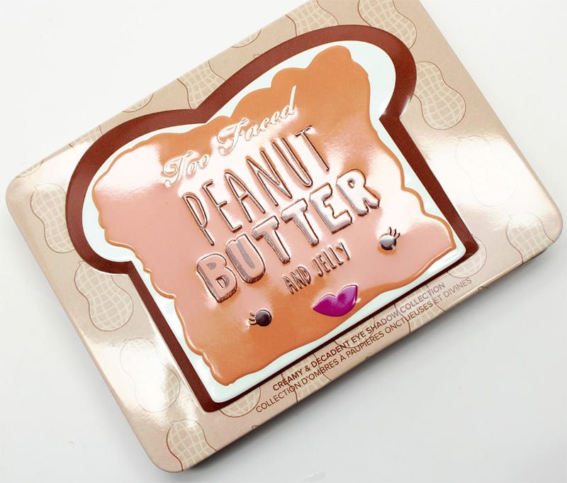
Too Faced Peanut Butter and Jelly Palette
Today I’ve got the Too Faced Peanut Butter and Jelly Palette to share with you. This palette is an Ulta exclusive, so you can only pick it up at Ulta or Too Faced. Too Faced sent me this palette.
Too Faced Peanut Butter and Jelly Palette
If you like this video give it a thumbs up, share & subscribe!
Price
$36 – 3 Eye Shadows: 2.0 g / 0.07 Oz. 6 Eye Shadows 0.9 g / 0.03 Oz.
About the Too Faced Peanut Butter and Jelly Palette
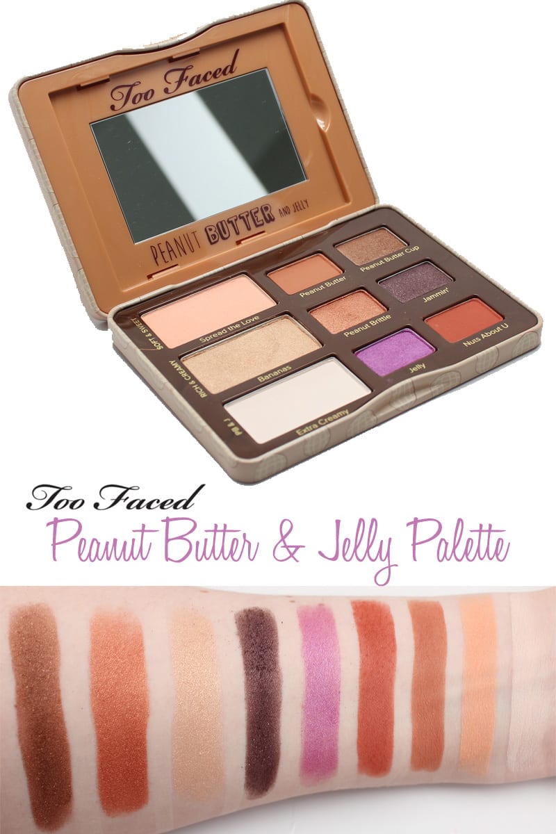
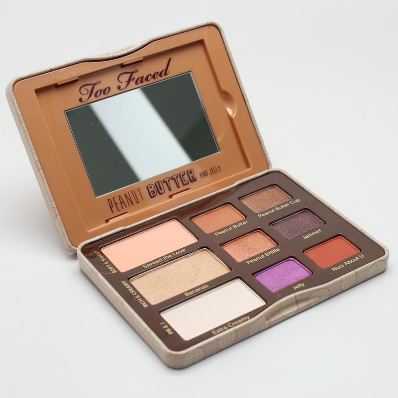
Inspired by the social media sensation that is Peanut Butter from our bestselling Semi-Sweet Chocolate Bar Collection, we created this peanut butter palette of nine gorgeous matte and shimmer shades featuring antioxidant-rich cocoa powder with a creamy peanut butter twist!
- Infused with antioxidant-rich cocoa powder
- Smells chocolatey to me
- Doesn’t contain peanuts
I swatched these on bare skin with my finger tips. I always recommend using primer when wearing eyeshadow so that your eyeshadow will be more vibrant and stay locked in place all day.
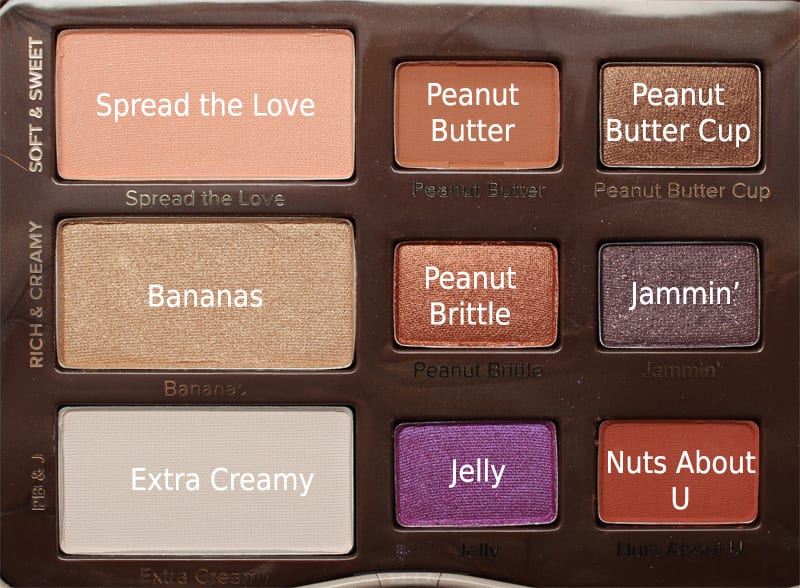
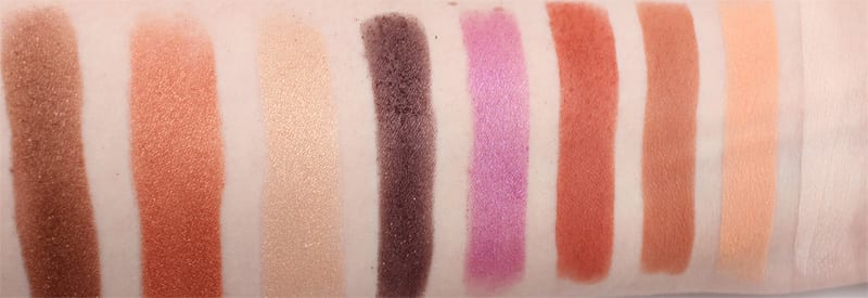
Extra Creamy
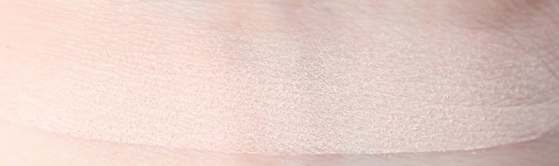
Matte Creamy Beige
Light creamy beige matte, perfect for my skintone for a base shade. You could also use this shade to blend out the edges of other colors.
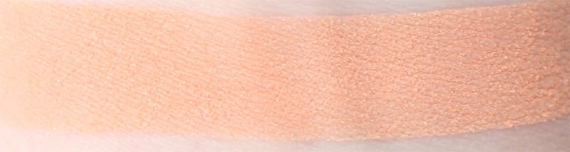
Spread the Love
Medium Peach with Gold Sparkle
Midtone peach matte with subtle gold sparkle. This would be a pretty, nearly matte lid shade. It would also work well for a transitional crease color.
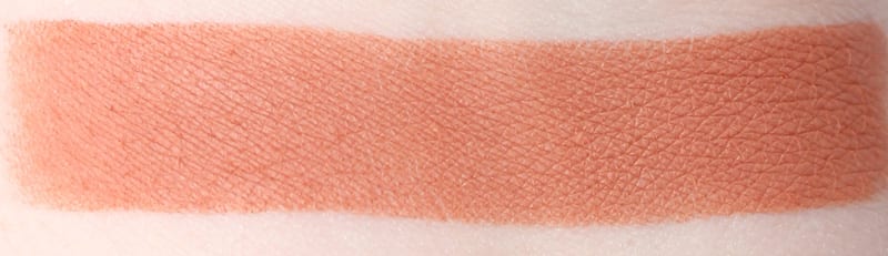
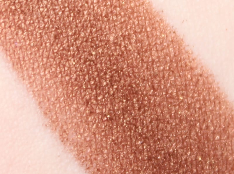
Peanut Butter
Matte Medium Orange Brown
Midtone orange-toned brown matte. This is a good, warm crease shade.
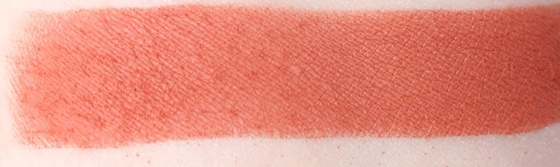
Nuts About U
Matte Brown with Red
Deeper than midtone brown matte with orange-red tones. This is deeper and more orange-red than Peanut Butter.
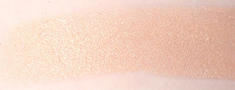
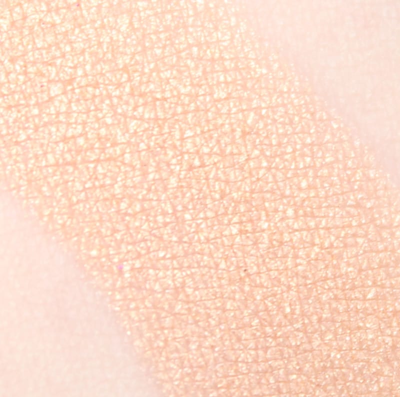
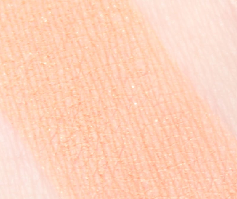
Bananas
Soft Peachy Gold with Fine Gold Shimmer
Metallic light peachy gold with gold sparkle. This would make a great lid shade. It would also be pretty layered on top of another color like Spread the Love at the center of the lid for a halo eye.
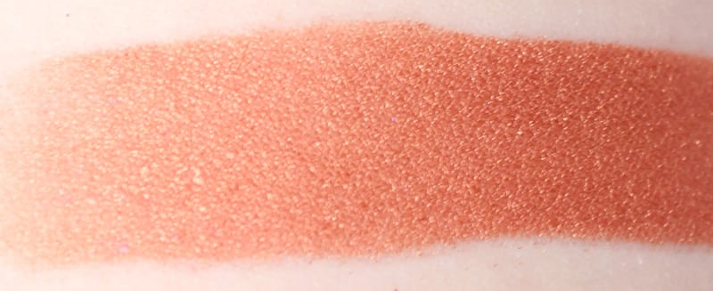
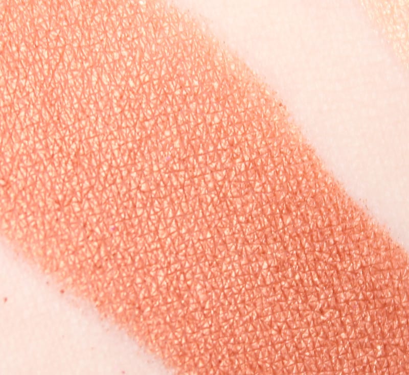
Peanut Brittle
Metallic Burnt Orange
Metallic copper orange. You could create a fun smoky eye with this shade and a black or dark brown eyeshadow.
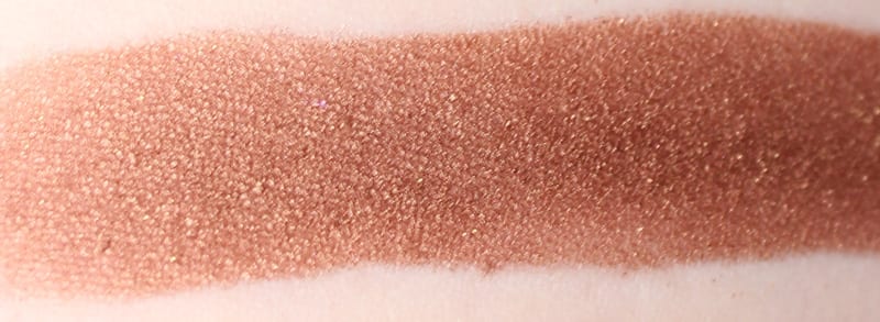
Peanut Butter Cup
Metallic Golden Bronze with Gold Sparkle
Metallic orange-toned brown with gold sparkle. this is my least favorite shade in the palette and I wish there was a pink or purple jelly shade instead of this one. There are so many browns in the Too Faced lineup.
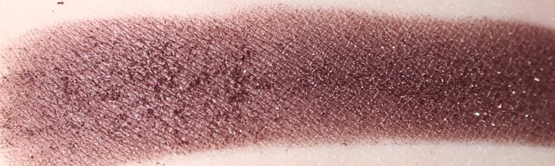
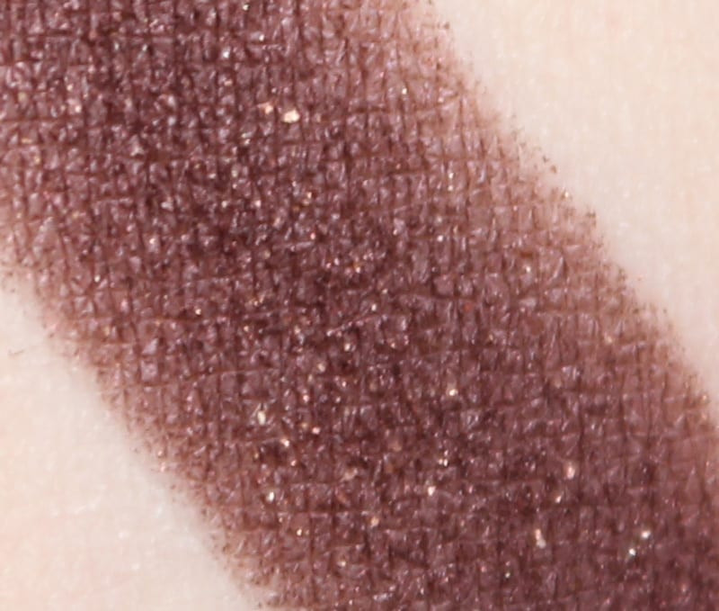
Jammin’
Dark Chocolate with Golden Sparkle
Dark brown with purple undertone and gold sparkle. This color works well with Jelly but seems out of place with the rest of the shades.
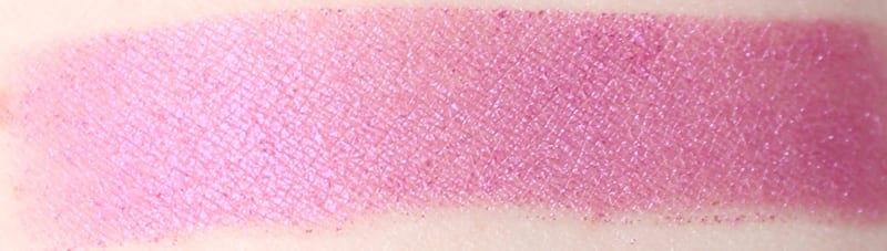
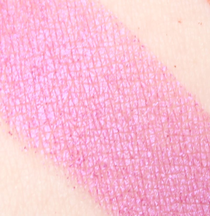
Jelly
Vibrant Orchid
Midtone pinky-purple satin. On the sheer side. Benefits from a purple base. I am disappointed that this purple isn’t more pigmented on its own, but I did create a gorgeous tutorial with it by using Too Faced Purple Rain pencil.
My personal opinion is that this palette should have more ‘jelly’ inspired colors and less orange and brown. I mean sure, having Peanut Butter makes sense! But Grape Jelly (purple) and Strawberry Jelly (pink) would have worked perfectly with Jelly (pinky-purple).
If you love how you look in warm orangey-browns or red-browns, you’re going to love this palette.
With the exception of Jelly, I feel that the eyeshadows performed really well for me. The mattes are especially nice. If you’re a fan of bright eyeshadows, skip this palette, it’s yet another palette geared towards neutral lovers.
What do you think of the Too Faced Peanut Butter and Jelly Palette?
Looking for more?
- Too Faced Peanut Butter & Jelly Palette Tutorial
- Too Faced Chocolate Bon Bons Palette Review
- Too Faced Chocolate Bon Bons Palette Tutorial
- Too Faced Semi-Sweet Smoky Chocolate Bar Palette Tutorial
I love orange/orange-y shades so I was super excited for this palette! I’m really glad I got it! I recently wore Bananas on the lid & inner corner…so pretty! Nuts About U smudged around my lashlines made my eyes GLOW. Gorgeous shade! Spread the Love, Extra Creamy, Peanut Butter, Peanut Brittle…love them all!!! The only color I dislike is Jammin’. It looks muddy on me and doesn’t work with the rest of the colors. Jelly is a great shade but definitely needs to be built up +primer. The packaging is super cute – the detailed tin is adorable!!!
ITA – I wish this palette had MORE JELLY!!! Since it’s a peanut butter & jelly palette I feel like every row should have one jelly shade in it. I also wish so much there was a strawberry jam shade (pink or
reddish-pink). I loved eating peanut butter & strawberry jam sandwiches as a kid! Another combination I loved as a kid was peanut butter and marmalade sandwiches. Marmalade would have worked well with the other shades too!
Love the colours!
Thankfully was still available at ULTA and I got it-another note, I was looking at the shades in my Natural Matte Palette, and these will make for some stunning crease shades, blend! <3 <3
I think it’s a fun one, and will pair well with the other shadows in my collection! Can’t wait to try their matte lipsticks!
I was finally able to order it yesterday. can’t wait for it to arrive!
Hey Girlie I Hope You are Enjoying Your Monday? I Really Like the Peanut Butter and Jelly Palette and My Favorite Colors in it are Jelly & Peanut Brittle! I Think it’s a Nice Neutral Palette to Carry in Your Purse if You are On the Go a Lot! I Actually Look Best in Orange, Rust, & Brown Colors b/c I Have Fair Skin but I Have Dark Hair & Blue Eyes! Unfortunately I Can’t Pull Off a Lot of Bright Colors and They are My Favorite! Oh Well! Well I Hope You Have a Good Day My Dear! Lots of Love, Jana
The colors in this palette are a bit too warm for my skintone and I agree that there should have been more jelly shades. I don’t feel like Jammin’ is out of place because I see it as an eye liner shade or a way too cool down and smoke out the warmer orangey bronze shades.
It’s a nice concept but, those orangey shades are probably difficult to pull off and I bet they’d make me look sickly.
I think they can be hard to wear if you’re pale and cool toned.
You know it is an adorable concept that they have going here, however as Lisa and yourself have mentioned, there are too many orange colours and warm tones. I certainly think that a few tarty raspberry colours should be included.
I just love the Packaging
The packaging is definitely cute 🙂
Does it make you want to eat it- like I want to eat it right now?
*heads off to make peanut butter sandwiches* 😀
Cute concept but there are too many warm-toned brownish shades for my personal preference. I agree that this needs more jelly, or they could have just called it the peanut butter palette and included shades inspired by other foods commonly paired with peanut butter like marshmallow fluff, apple slices or celery. LOL
Lol, marshmallow fluff! I used to love that stuff. Yes, definitely an uber warm toned palette.
I love your green eye look in this video! It’s incredibly beautiful on you. I hope a tutorial will be in the works.
I’m definitely getting this palette. I think the colors will bring out the green in my eyes. I know Jammin’ seems like an odd choice just looking at the shades in the pans. I’ve done peachy-orange looks with Aubergine shades similar to Jammin’ blended into the crease and outer V, and the colors play off each other nicely.
So would you recommend trying Spread the Love on the lid / crease, deepening the crease with Jammin’? Yes, I recorded a tutorial for the green look, hopefully it turned out ok.
That, or even Peanut Brittle on the lid and Spread the love in the crease, and deepened with Jammin’ in the crease and outer v of the lid.
Can’t wait to see the tutorial.
I’d love this, but I never wear those orangey shades.
Orange are definitely flattering if you have blue eyes, but I find them challenging to wear.