
Kat Von D Chrysalis Eyeshadow Palette Review

During the Sephora VIB Sale I hauled the Kat Von D Chrysalis Eyeshadow Palette. Kat Von D released this palette and the Monarch Palette (currently sold out online at Sephora), at the same time.
Kat Von D Chrysalis Eyeshadow Palette Review
If you like this video please comment and subscribe!
About the Kat Von D Chrysalis Eyeshadow Palette
From subtle to sultry, experience a rebirth of color and explore endless eye looks with the Chrysalis Eyeshadow Palette. Featuring cool-toned shades in an ingenious arrangement that gives you the biggest basics and the most accent hues, now you’ll have the freedom to create your heart out without running out of the go-to colors. Relish in the luxurious texture of triple-milled powder, which picks up instantly and lays down with a one-sweep, full-coverage application. The patented Power Last™, long-wearing formula gives you buildable, from dawn-to-dusk drama, while an infusion of antioxidants including rose extract and vitamins A, C, and E all work to keep your eyelids hydrated and protected.
- Antioxidant Complex: Protects the delicate eye area from free radicals.
- Rose Extract: Softens and moisturizes the skin.
- Vitamins A, C, and E: Nourish and hydrate the eyelid.
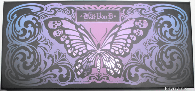
Inspired by the metamorphosis of the butterfly, Kat created this palette to give you endless ways to transform your eyes every day. The palette is decorated with original artwork derived from her love of butterflies—a symbol of rebirth and renewal.
Price
$46
Amount
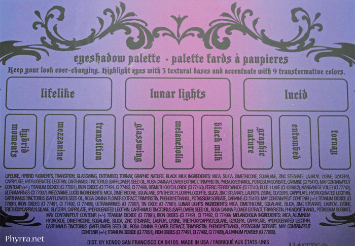
3 x 0.095 oz Eye Shadow in Lifelike (matte cream), Lunar Lights (pearl gray), Lucid (sparkle rose)
– 9 x 0.049 oz Eye Shadow in Hybrid Moments (matte deep purple), Mezzanine (sparkle violet), Transition (pearl mauve), Glasswing (matte caramel), Melancholia (pearl silver), Black Milk (matte gray), Graphic Nature (pearl charcoal), Entombed (pearl blue), Tornay (matte navy)
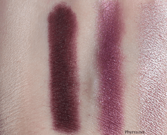
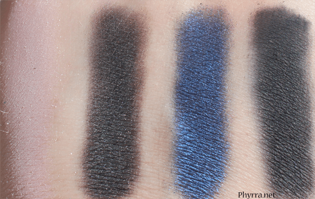
All swatches on Coastal Scents Shadow Worx primer. Swatch pictures taken in direct sunlight.
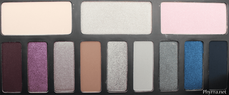
Lifelike
demi-matte creamy white
Hybrid Moments
deep plum purple matte
Mezzanine
sparkly violet (tiny bit of fallout, semi sheer but can be built up)
Transition
pale mauve pearl

Lunar Lights
light metallic grey, this is too shimmery for a base color in my opinion
Glasswing
matte caramel brown
Melancholia
metallic silver
Black Milk
light matte grey, really silky
Lucid
pale pink with silver sparkles, love this
Graphic Nature
deep charcoal pearl
Entombed
deep navy blue pearl
Tornay
blackened navy matte
My Thoughts
I got sucked in by Chrysalis the packaging. The packaging is utterly gorgeous. The butterfly design with little skulls head, plus the shades of pink and purple across the front, it’s all beautiful. It totally sucked me in. I wish the eyeshadows more closely matched the palette colors. The names of the eyeshdows are on the back of the palette, so that’s nice, but I still wish they were printed beneath each shade. The palette is made of cardboard, which feels sturdy, and has a mirror in it.
Sadly, the palette doesn’t come with a look book with tutorials on how Kat would wear the colors. However, the colors are arranged into 3 sets of 4, to give you an idea of how to wear the shades together.
I don’t necessarily feel like this is an entirely cool toned palette. I feel like the purples are not purple enough, they’re too plummy. So that disappointed me. I feel like Graphic Nature and Tornay are too similar; you can barely tell that Tornay is supposed to be blue toned, as it translates as a charcoal shade to the hand.
The shades that I like in the palette are Lifelike, Lunar Lights, Glasswing, Melancholia, Black Milk, Lucid, Graphic Nature and Entombed. Hybrid Moments is too plummy for my taste. I’m not really a fan of Mezzanine either, though I wanted to be. It does have pretty sparkles in it, but again, it’s like a plum wine. I don’t like Transition at all. I really like all the smoky grey shades and think that they’ll work nicely together. I also like Glasswing, the caramel, since that’s a color that I’ve used in my crease lately. I feel like they’re all really useful shades.
I do feel like several of the shades kick up powder when you drag your brush across them, so if you don’t dab at the palette carefully, you’ll ended up with wasted product. If you’re someone who rarely finishes a palette, like me, this may not be a dealbreaker issue for you. If you’re someone who uses a palette to the last drop, you’ll want to keep this in mind.
I do feel like this is a good value for the price because you’re getting essentially 9 almost full size eyeshadows (if you count .05 oz as full size, since these are .049, so really close) and 3 nearly double sized shadows at .095. A typical Urban Decay eyeshadow is .05 oz for $18, while a MAC refill is $10 for .05 and a regular is $15 for .05. This palette breaks down to about $3.83 a shadow.
If you’re a fan of Kat Von D eyeshadow palettes and you like greys, you might like the KVD Chrysalis palette. If you like plum purple, you might like this palette. I’m not completely sold that it’s amazing. I am a little let down that the colors weren’t as cool toned and the shades I prefer, but I’m still glad I picked it up on sale.
What do you think about the Kat Von D Chrysalis Eyeshadow Palette? Love it? Hate it? Have it? Let me know below!
Pros
- Cruelty free
- Some cool toned shades
- Good value for the price
- If you like smoky shades, you’ll love the majority of this palette
Cons
- If you aren’t a fan of plummy purples, skip this
- If you don’t like cool toned palettes, skip this
- If you can’t stand powdery shadows, skip this
Hybrid Moments and Entombed are my favorite shades from this palette in my personal opinion.
I’ve never wanted to buy Kat Von D before, but this looks gorgeous! I love the idea of choosing a warm/cool palette based on one’s preference. Awesome review! 🙂
I like the packaging, but it’s not enough reason for me to buy it! lol. I actually like the purples, but I agree that they should be more blue-toned for this palette. I think that with the amount of palettes I have, this one just has too many negative points for me to get it. Kinda wish I had gotten her Spellbound palette when it was out, people seem to love that one!
You make this look so pretty! I want the other one but you’re making me think I need this one as well…
Nice palette!
The packaging itself is awesome. I love the Lucid shade as well.
The packaging alone sold this for me.
I like the look of Entombed and Melancholia, but those purples will just make me look like I have bruises. I love plums on my lips, but not the eyes. The packaging design is stunning as always, though!
Those burgundy shades are to die for. I love the pigment of her shadows.
The design of this palette looks just so …wow! Unfortunately the shades in this palette aren´t really my cup of tea.
I can’t wear cool colours so I’m more interested in the Monarch palette, which looks more warm toned to me. But great swatches and review anyway!! (Does anyone know why KVD isn’t sold in the Sephora’s outside of North America?)
Not sure, but that’s a good question.
when you first posted about this palette, i almost bought it because of the gorgeous packaging! but after a lot of thought, i decided the purples quad reminded me too much of wonderland and wtf in her spellbinding palette, the silvers and neutrals didn’t seem that unique (altho the shades are nice! i really like your swatch of melancholia) and i remembered the powder kick up issue from the spellbinding palette being annoying. that left me with love of packaging and that cobalt blue as reasonings for wanting the palette. i decided to stay strong and resist the urge! your review, thankfully, just reinforces this decision although i do love lucid too!
Yeah, you probably did the right thing! I should have resisted too.
but when you don’t, all of us benefit! 😀
I was so excited for this palette, but from your swatches a few of the shades I was most excited about may not translate as well onto the skin as I had hoped. I guess I’ll have to swatch in person before I make a final decision on it.
I was disappointed with some of them, which is too bad, because they’re nice colors, just not what I wanted.
The colors are beautiful, but I just can’t get behind cardboard packaging. I’m always afraid to travel with them, especially if there isn’t some kind of locking mechanism to keep it closed.
The packaging doesn’t bother me because it feels sturdy, not cheap and flimsy
Let us know how that cream shadow holds up! I remember her older palettes with creams and they would always seem to dry up so quickly which was a bummer since you had to scrape away to get anymore use out of it. So much wasted product 🙁
These are all powders, no cream formula. The color is a creamy white.
Oh okay good! I was reading the descriptions on sephora and got a little worried that they would be actual creams 😉
I was super excited about this palette when it was released, but I just don’t like those purple shades. I personally don’t think that plummy purples look good on me. I have very fair skin, so it looks like my eyes are bruised when I wear shades like those. :-/ The Monarch palette looks pretty, so I might get that one instead.
I know exactly what you mean! I like blue-based purples, not these red-based.
Ok, I’m glad it’s not just me! I see so many eye shadows like this, so I know that some people must really like those shades, but they’re definitely not for me.
Definitely not just you!
Both of the Monarch palettes are gorgeous – Im sooooo tempted >.<
I think they’re both pretty. They nailed the perfect packaging.
I do not have this palette! But, I am like you if I had seen this I would be suckered in by the packaging. I absolutely love butterflies and the packaging is beautiful. I am going to swatch the colors on my hand next trip to Sephora. I just wanted to invite you to my Funday Friday Comments Tag blog post today. I am doing to this to try to get to know my readers/subscribers and fellow bloggers better. I am hoping to make this a weekly type of post. Hope you come play tag with me! Tag!! Your it!
It’s hard when the packaging sucks you in!
I love the look of Hybrid Moments, Mezzanine, and Melancholia. Very pretty palette.
So the plummy purples suit you 🙂